My clients C&T had recently moved into their bay fronted Edwardian Terrace and had quickly got to work refreshing the rather neglected interiors, however they really wanted some guidance with what was to be their family living room. They knew that they ideally wanted blue as the main colour however too many hours on Pinterest and 20 tester pots later and they had become overwhelmed and totally confused about the direction they should go in. They were also worried about making the room too dark and we’re beginning to lose their confidence of working on a bold design. I visited them at their home to not only take a look at the space but also to understand C&T’s style better. It was definitely a worthwhile visit as the photos they had previously sent to me of the room didn’t show the wood chip which ran from the picture rail and over the ceiling. C&T explained that they were on a strict budget for the room and they were worried about the cost of removing the wood chip but after discussing it together I explained that the investment would definitely pay off in terms of end results and longevity. To help them make the decision I put them in touch with my local decorator so they could gain an estimate and speak over the work in more detail from which they decided to go ahead and I’m pleased to say they are really happy they did!
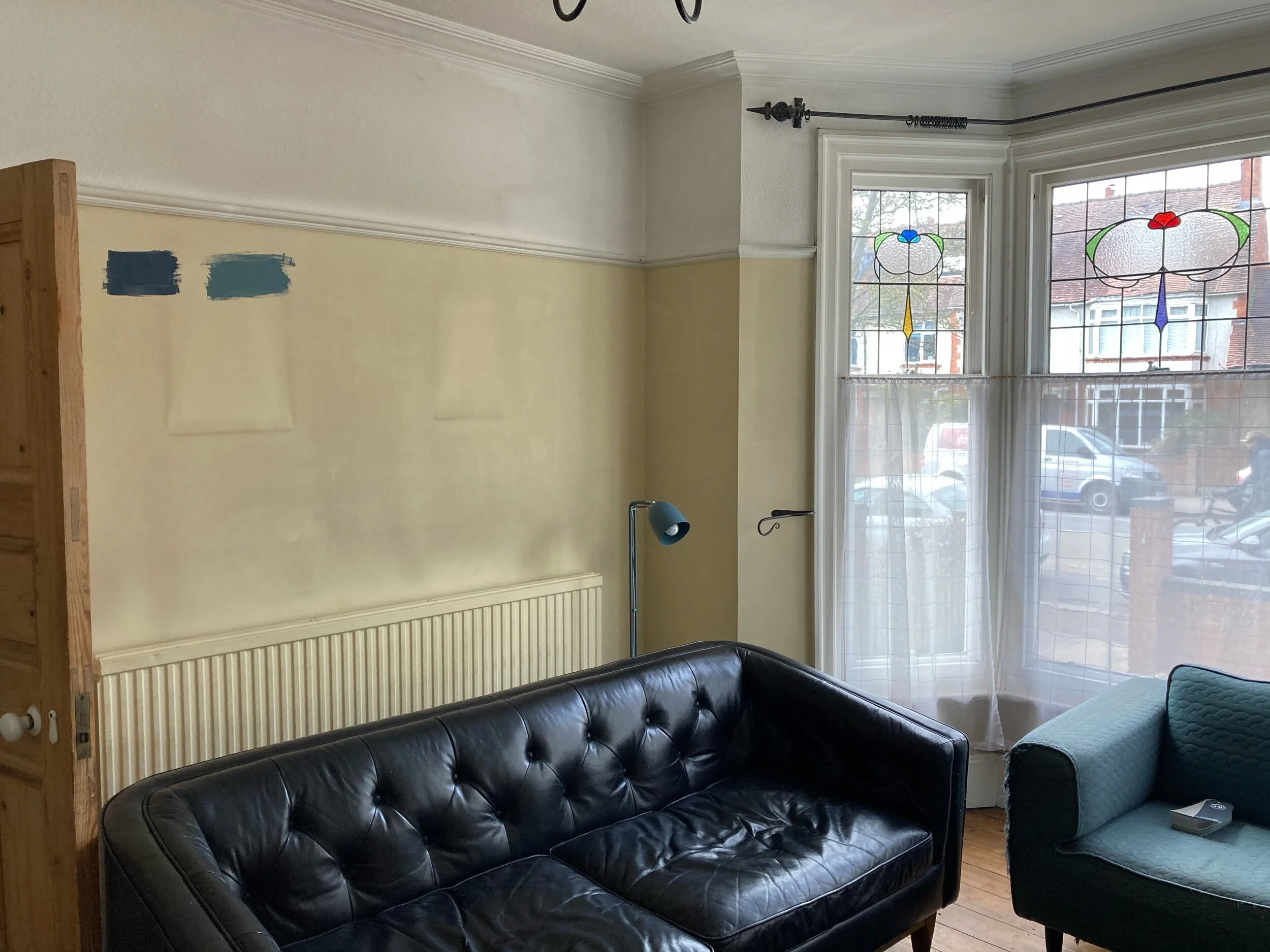
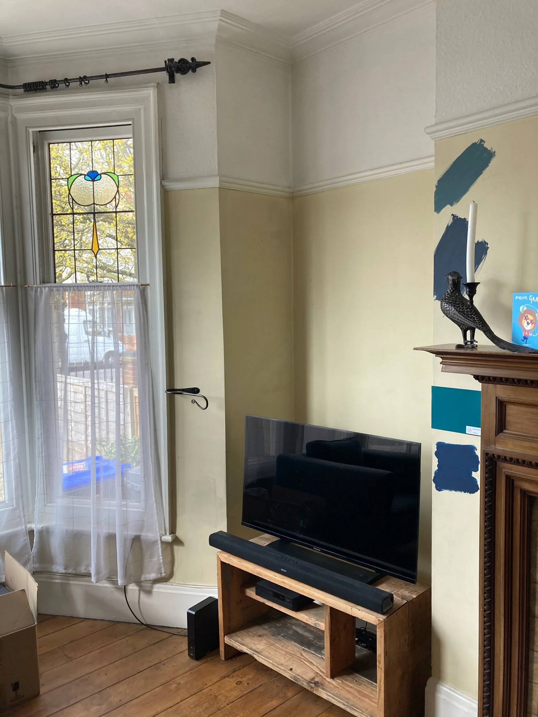
Some pictures of the room before…
Living Room Before
Wood Chip Above the Picture Rail. As you can see my clients had already started to tie themselves into knots with many paint samples!
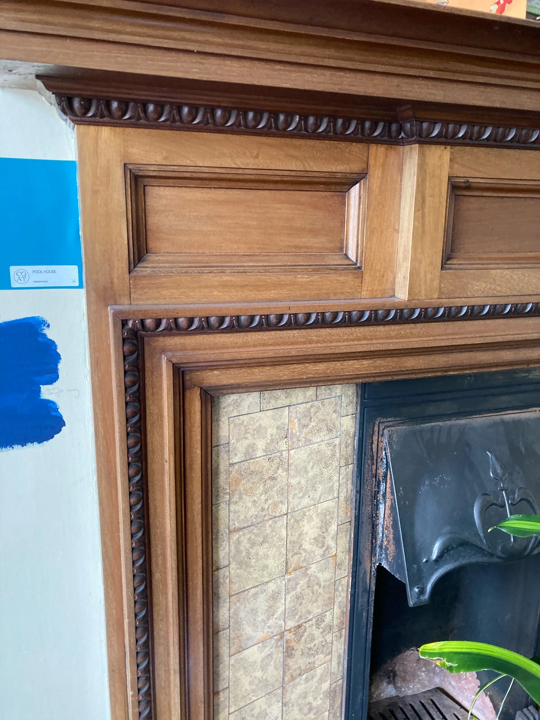
Fire Surround and Existing Tiles
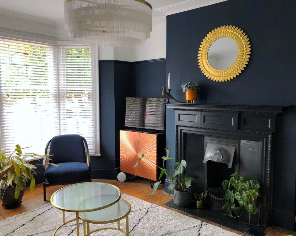
From the photos you can see that the picture rail is set fairly low, however we were keen to keep this as a feature so to ensure that a sense of height was retained in the room the rail was removed from the chimney breast and the colour taken up to the ceiling.
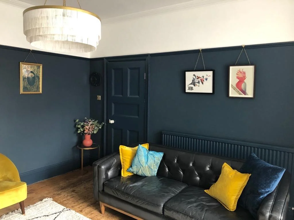
Living Room Painted in Farrow & Ball’s Hague Blue
The huge fireplace also needed an update with the beige 70’s tiles and the issue with too much wood in the room from the surround, floor boards and pine door. For a quick fix the wooden surround was painted in Farrow &Ball’s Railings and although replacement tiles were sourced C&T were happy to paint over the existing tiles in Railings too for an instant and affordable alternative which looks very effective. To combat the rest of the wood issues a large area rug was selected for the floor to give a cozy feel and I recommended that the pine entrance door should be painted the same colour as the walls. (You can also see from the below the skirtings, picture rail and radiator were all painted blue too for a seemless feel).
Wood Work and Radiator Painted in Hague Blue
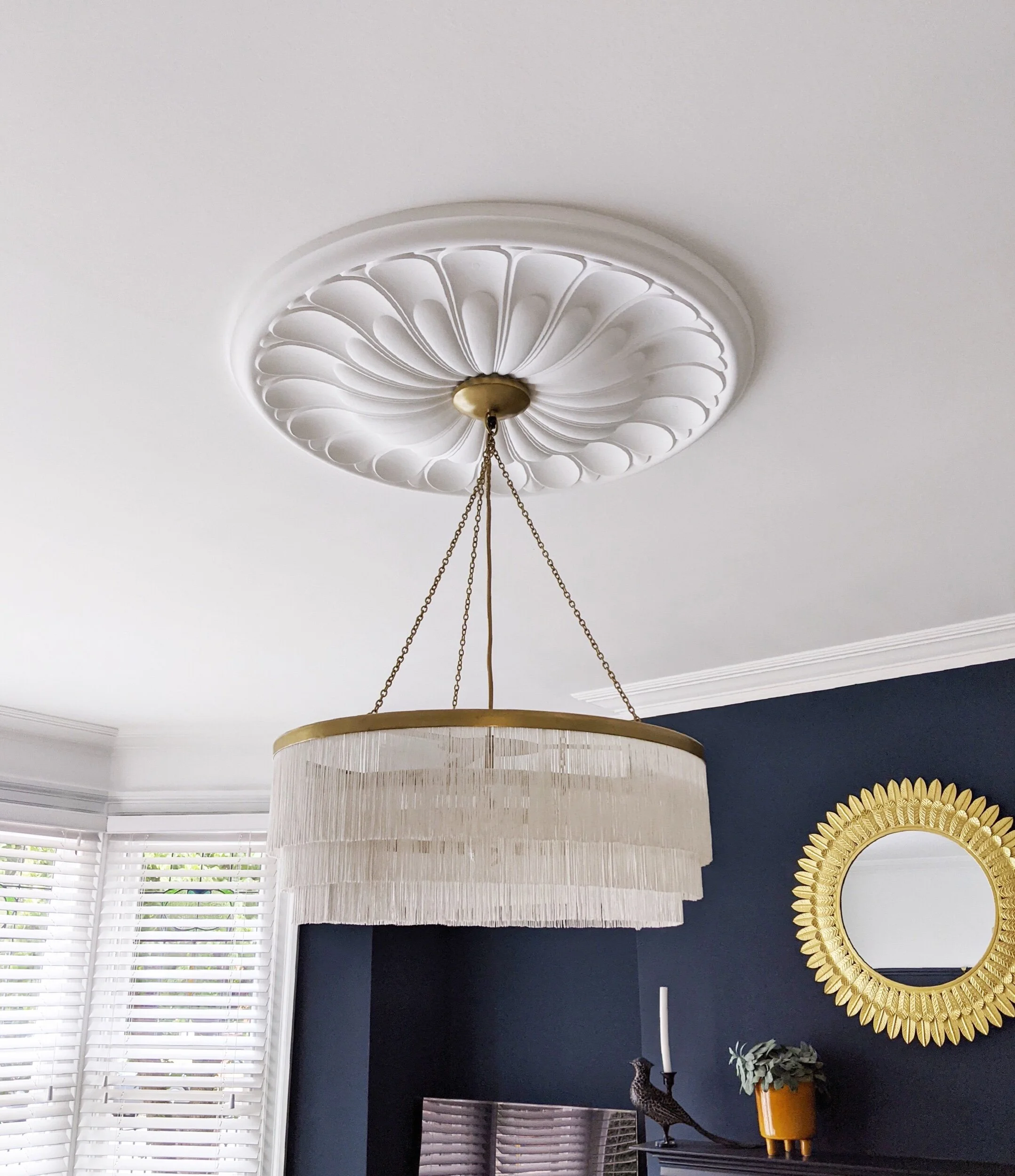
Apart from the removal of the wood chip my big insistence for the room was to bring character back to the ceiling by adding a statement ceiling rose and chandelier. I recommended this beautiful rose from Plaster Ceiling Roses finished with a fringed chandelier from Rockett St George which has helped to transform the room and give the eclectic feel my clients were after.
Plaster Ceiling Rose and Rockett St George Chandelier
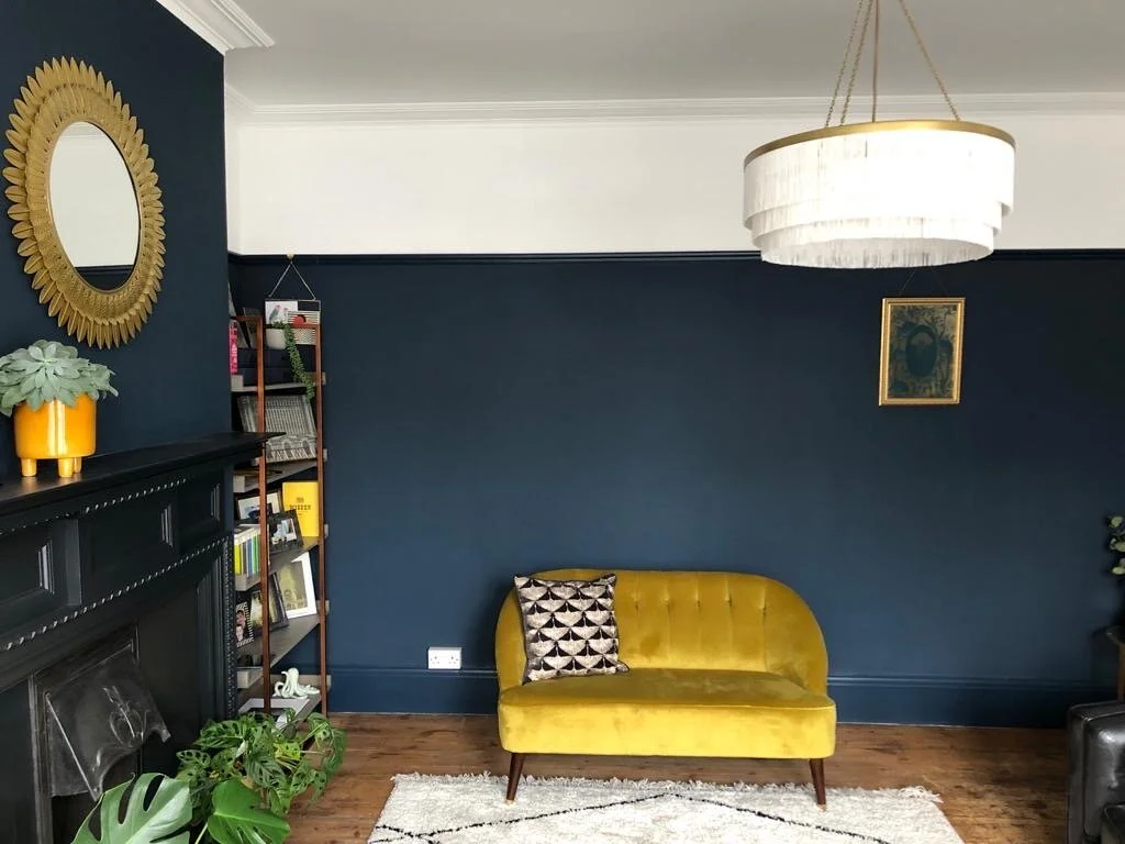
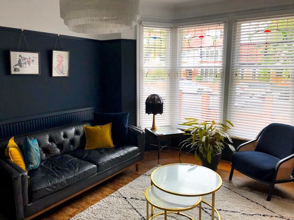
They wanted to keep their characterful leather sofa but needed additional seating. I selected a wonderful velvet and cane armchair from Made.com to sit in the bay window and a rich gold occasional sofa which contrasts well with the deep blue walls and helps to add a much needed accent colour to the room. In terms of room styling I provided C&T with two different mood boards each similar but with different accents and varying budgets to help them make more informed decisions over the style direction, they found this process very helpful as they had been struggling to envision the completed look of the room and how their existing possessions would fit in.
Circular elements were added to the room to counterbalance the straight lines and add a more sociable feel, these included the coffee tables from Cult Furniture, deco style mirror and of course the chandelier. I hope you love this affordable yet effective design, I really enjoyed helping my clients create a room that they love, sticking to their budget and giving them the confidence to use statement colours. If you’ve been inspired by this room refresh visit my ‘shop the mood board’ edit for more details of how to achieve the look in your own home.
